
Hello, Data Enthusiasts!
Welcome to this week's edition of Dash of Insight. We've scoured the web to bring you the freshest and most exciting developments in data visualization and analytics. Let's dive into the stories that are shaping our data-driven world.
Top Articles from the Past Week
Using Local Data to Better Measure and Reduce Landfill Emissions
How AI Agents and Machine Learning Are Revolutionizing Business Automation
AI's Hidden Environmental Cost: The Water and Power Behind Every Chatbot Response
Visualizing Repeated Flooding: Using Data to Drive Policy Changes and Protect At-Risk Communities
Using Local Data to Better Measure and Reduce Landfill Emissions

Summary: Idaho National Laboratory found that their landfill's actual emissions were much lower than what models predicted, showing the importance of using local data to effectively reduce greenhouse gases.
Read more: Link to article
How AI Agents and Machine Learning Are Revolutionizing Business Automation
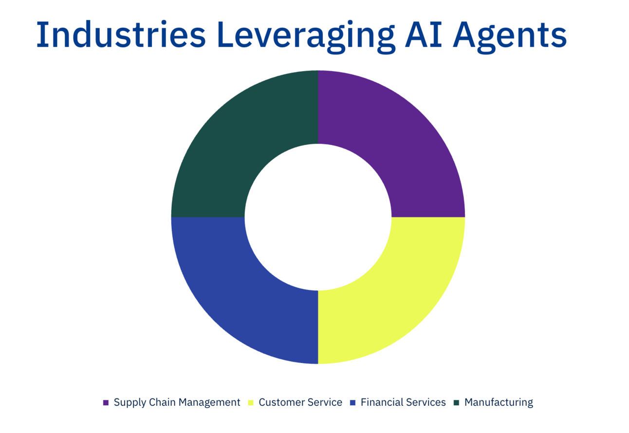
Summary: AI agents powered by machine learning are transforming enterprises by automating processes, enhancing decision-making, and increasing efficiency across various industries.
Read more: Link to article
AI's Hidden Environmental Cost: The Water and Power Behind Every Chatbot Response

Summary: AI chatbots like ChatGPT consume significant amounts of water and electricity to operate, contributing to hidden environmental costs. Each chatbot query uses resources comparable to everyday activities, with water and power demands that impact local communities and the environment. Efforts to make data centers greener are underway, but the rapid growth of AI continues to strain resources.
Read more: Link to article
Visualizing Repeated Flooding: Using Data to Drive Policy Changes and Protect At-Risk Communities

Summary: Many U.S. communities, particularly those with low incomes, are repeatedly affected by flooding, and data visualizations highlight the severity and patterns of this issue. By leveraging tools like interactive maps and graphs to illustrate flood data, we can better understand the problem and promote policy changes to reduce flood risks and help these communities adapt to climate change.
Read more: Link to article


Visualization of the Week: The 2024 Interactive Fall Foliage Map
Planning your autumn adventures just got easier! The 2024 Fall Foliage Map is an interactive visual guide that predicts when and where leaves will reach their peak colors across the United States. By leveraging historical data and current environmental factors, this tool helps you time your trips perfectly to experience the vibrant hues of fall.

Thanks,
Elizabeth
PS If you enjoyed these dashboards, please forward to a friend.
If you are that friend, subscribe here.
DashCaster: Turn Data Into Stories
Got some whirlwind data to share?